

Charts
The chart component has been designed to portray multidimensional query results in an intuitive fashion, while offering an almost infinite number of query types and quick rendering results.
The chart component renders numerous chart types in 2D format and renders a majority of those chart types in 3D format as well. The chart component also supports automated multi-charting and combo-charting, to facilitate the representation of the many possible data query dimensions in a quick and effective manner.
Chart Interactivity and Customization
All chart types offer full interactivity and "data navigation" through a right-click context menu, including drill downs/ups, expand/collapse, dicing, focus/eliminate and cube actions.
All charts can be customized and fully styled & themed via the Chart ribbon.
Each chart series can be customized separately, independent of the other data series used in the chart.
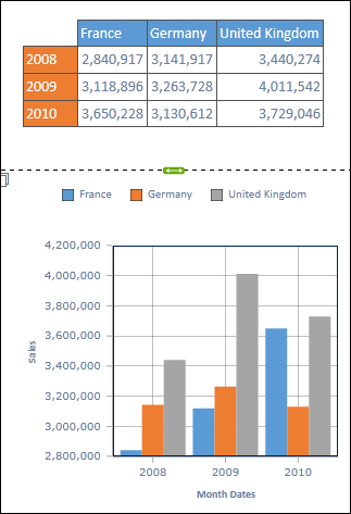
Standard Data Mapping
The the data from the underlying query is usually arrayed such that the series of the chart are derived from the columns of the query, while the categories of the chart are derived from the rows of the query.
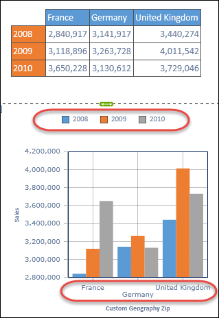
Pivot Charts
If the standard data mapping is unsuitable, users can choose to pivot the chart INDEPENDENTLY of the matching query, so that the series and categories are swapped. This pivot affects screen display only and does NOT re-query the database.
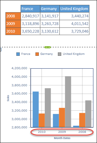
Reverse Chart Data
Plotted categories can sometimes appear on the axes in an inappropriate order. The Reverse Data function will swap this order around without requiring a re-processing of the query or the matching data set.
Single-Axis Charts
Most charts are "single" axis charts, in that the data is plotted by a single co-ordinate on the y-axis for each category (plotted on the x-axis). Different groupings of each data-point are called series (generated from the columns in the query table), and are represented in the legend by a common color.
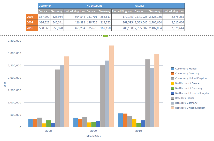
Multi-Axis Charts
Multi-axis charts, on the other hand, attempt to plot data-points using two or more values on the x, y and z axes. In this scenario, TWO or more series (columns) of data from the query are used to plot data points while data categories (rows) are NOT represented as items on the x-axis.
See Multi-Axis charting for more info.
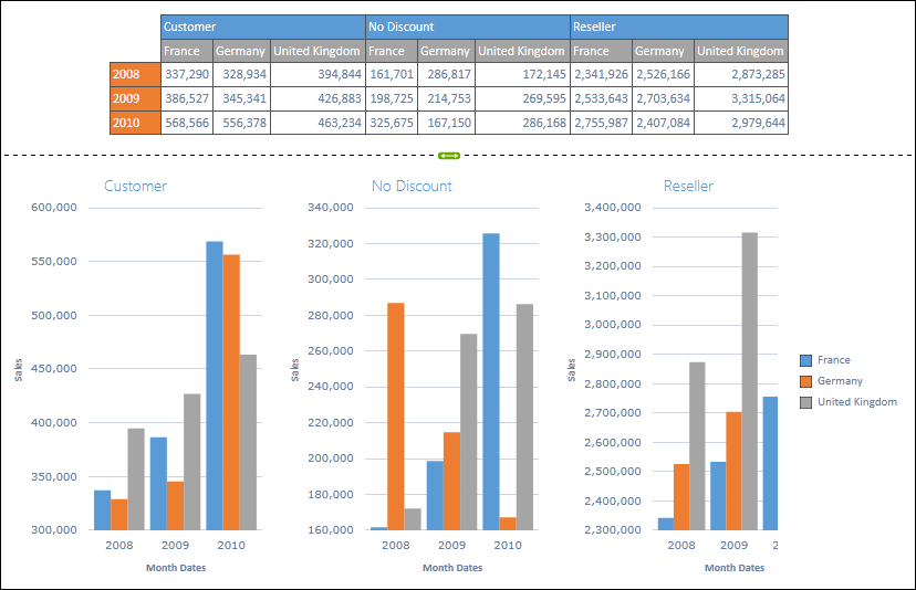
Multi Charts
If the user selects multiple dimensions in the underlying query, the chart will auto-merge the data points into a standard set of series and categories. However, there are times when it is far more convenient to view each set of series in its own chart. The Multi Charting feature to facilitate such analyses is exceptionally easy and accessible - making your data more relevant.
Click here for more on Multi Charting.
NOTE: Certain chart types automatically load up in the multi-charting format, to account for the multi-dimensional data set in the query. For example, Pie, Doughnut, Funnel and Pyramid charts.
Dual-Axis "Combo" Charts
An alternative to multi-charting is a dual-axis combination chart. This chart type allows users to plot data on both the left and right axes (for most upright standard charts) or the top and bottom axes (for most side charts). Further, users can elect to plot a certain series using a DIFFERENT chart type from the main chart. This combination of changes allows you to draw fairly complex yet informative charts with a few simple clicks - making your data more relevant.
Click here for more on combo-charting.
Multi-Combo Charts
Pyramid provides multi-combo charts, which are the most powerful combination. This is a super effective method for delivering in a few steps, a multi-dimensional view of your data graphically.
Click here for more on multi-combo-charting.
Chart Right-to-Left Support
The chart does not undergo a significant change in supporting right-to-left. The chart legend (like the textbox, grid and metadata trees) facilitates right-to-left functionality. When the book has been changed via the right-to-left layout button on the home tab, the chart legend will flip its data presentation - with the series colors and text alignment appearing on the right to support cubes in Hebrew or Arabic.
Home |
Table of Contents |
Index |
User Community
Pyramid Analytics © 2011-2022